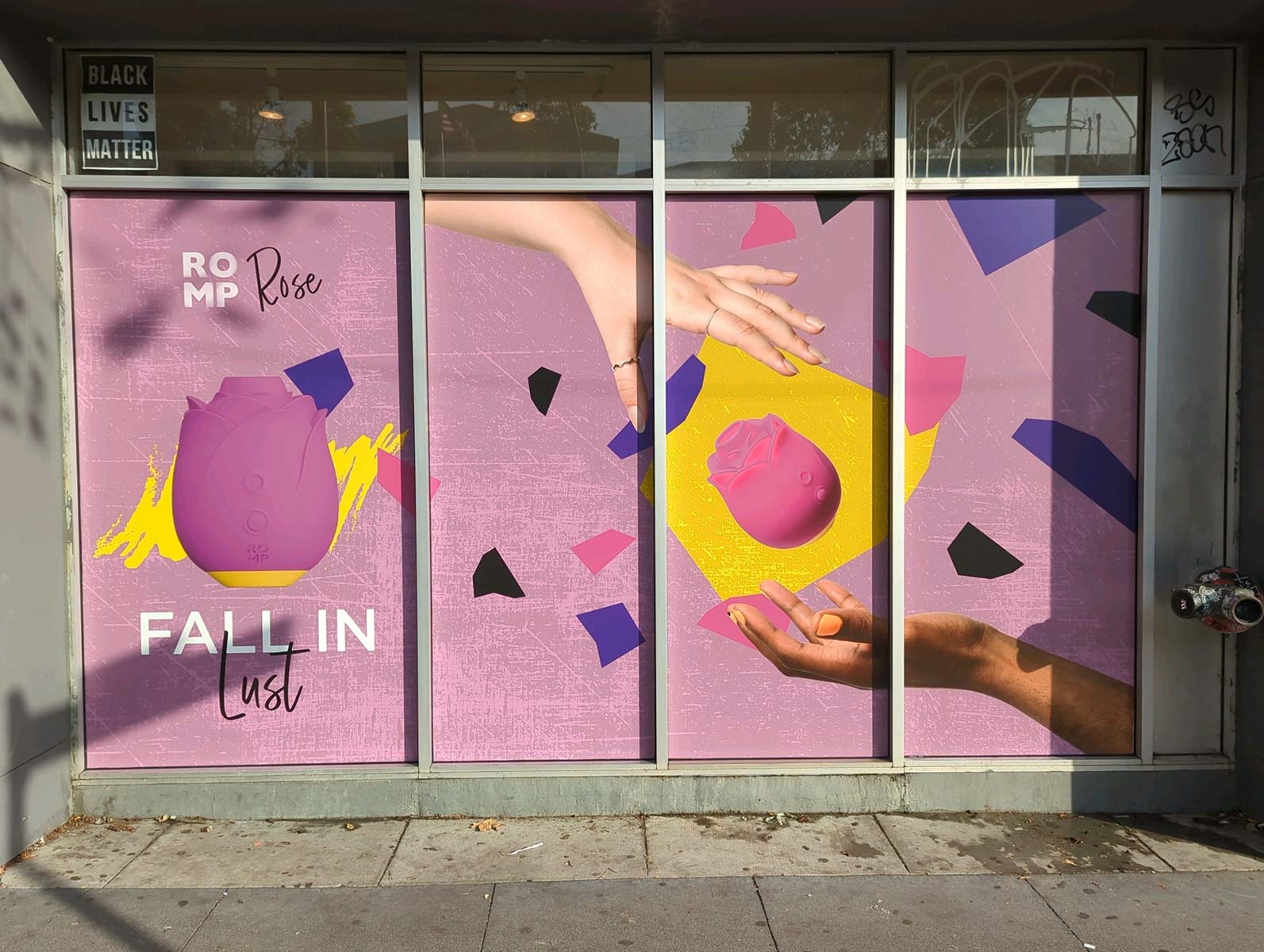
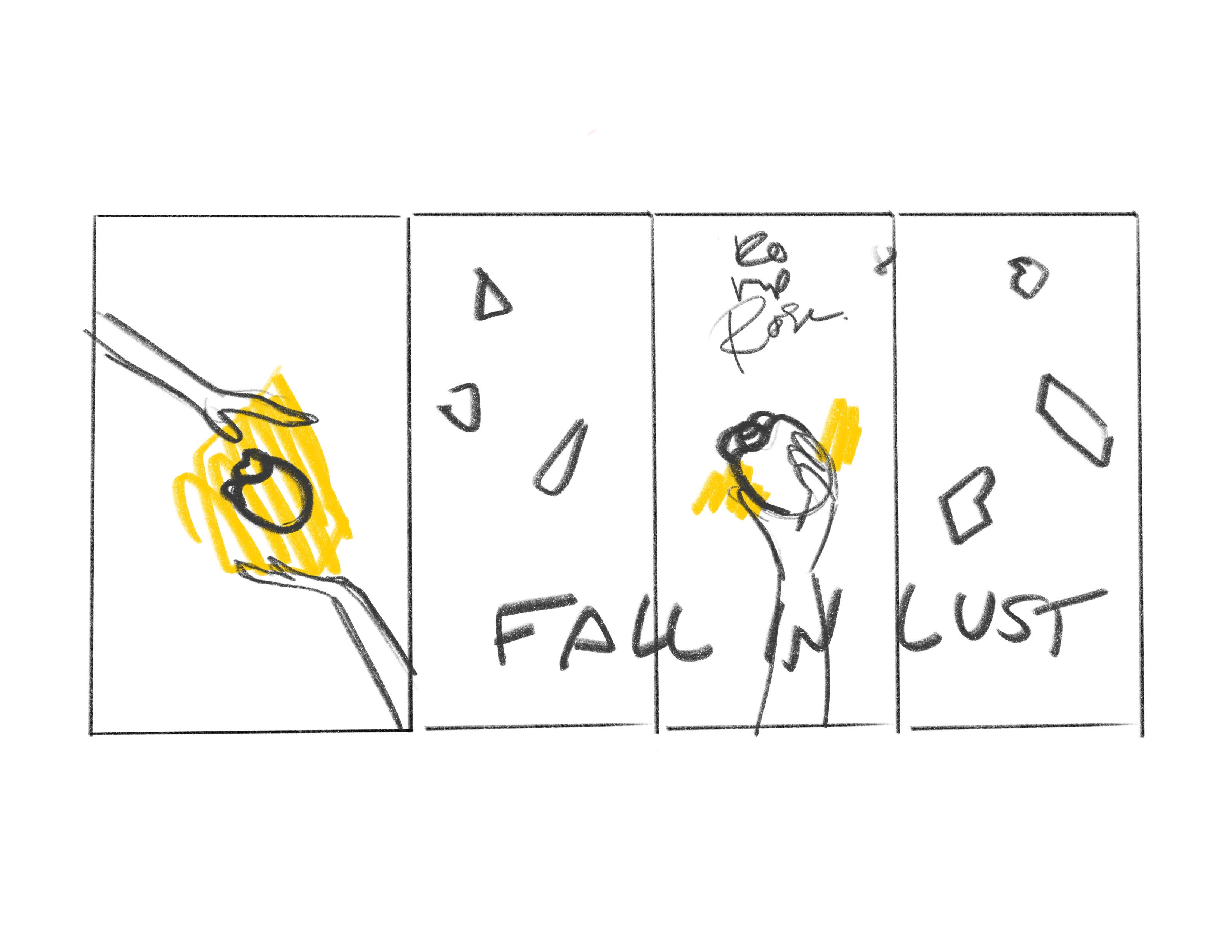
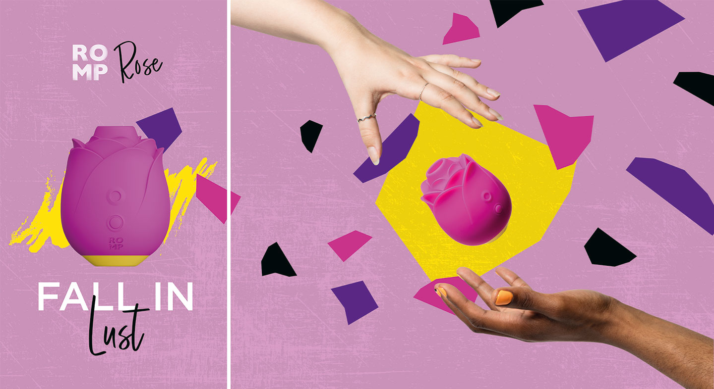
I treated the span of windows as two sections, distinctly divided by the sizes of the windows. After sketching a couple of layout ideas, I made the decision to limit all text to the largest window panel to ensure legibility.
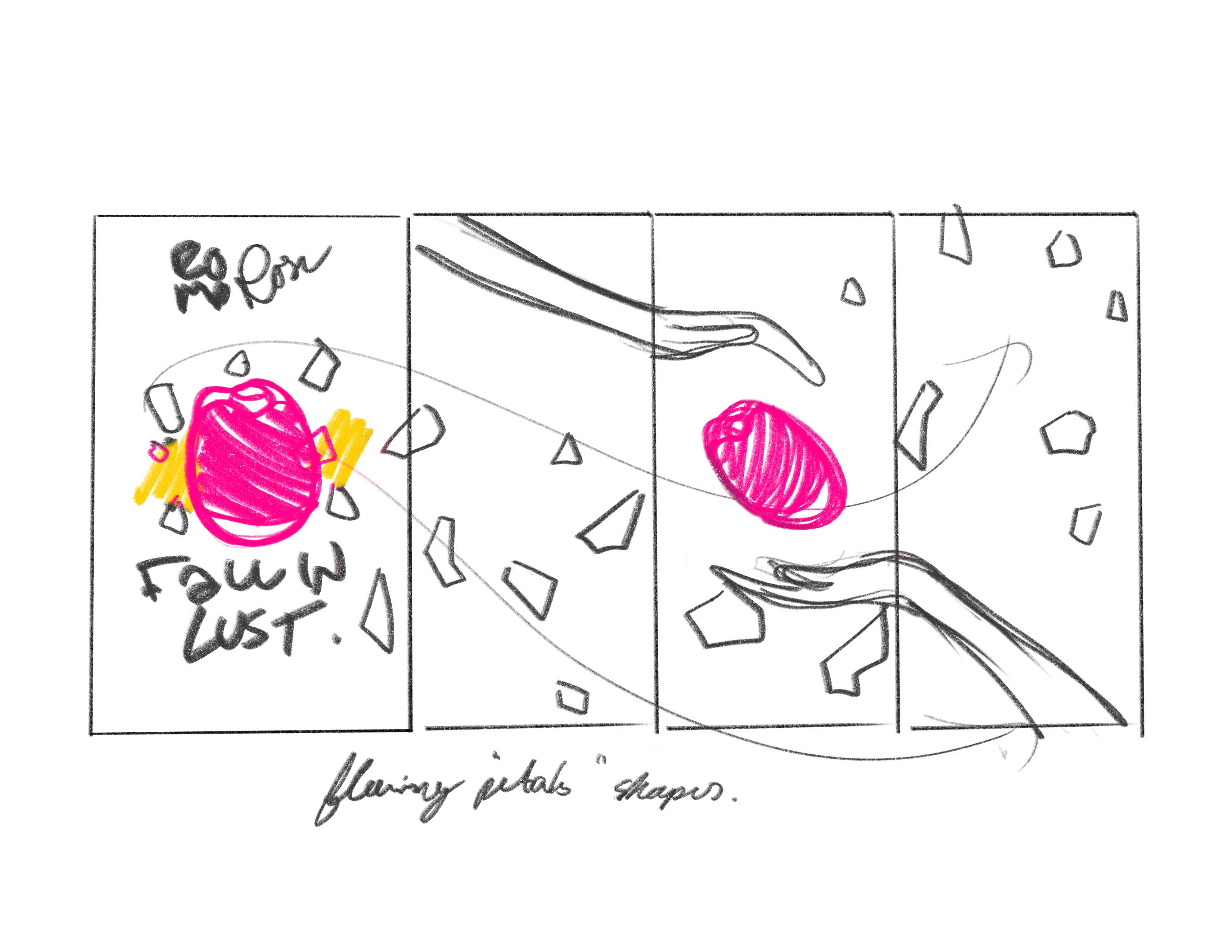
To tie the sections together, I used ROMP’s signature shapes featured on the product’s packaging to create movement by mimicking flower petals drifting from the product image to the rest of the graphic.